cinema collection: the director's cut
by clé tile | published: May 18, 2023

Now Showing
cinema collection:
The director's cut
FADE IN
1.
INT. VINTAGE MOVIE THEATRE — NIGHT.
deep red velvet curtains hang from an ornate proscenium arch. intricate, gilded molding runs up the stenciled walls. nymphs cavort on the painted ceiling. an animated buzz of people talking.
slowly, the lights lower. the hum ebbs away. the curtain sweeps open, revealing the screen. a blur of color, sound, motion.
LATER. QUICK CUTS.
the audience is transfixed. they gasp, laugh, cry, hold their breath then exhale — as one.
LATER.
the screen fades to black. darkness. a long beat. then clapping. cheering. slowly, the house lights come up… cut to a man wiping away a tear, pretending to scratch an itch. no one cares. they're all too moved.
the art of cinema — and the cinema collection
at clé, our love of fashion is well established. but in close second is that other most visual of mediums: film. film, when done well, stirs the soul and the mind. it transports us, it makes us feel, maybe even transforms us. sweeping romance, heart-pounding adventure, or intellectual indie, it’s entertainment. but it’s also high art. and it’s a big part of the inspiration behind cinema collection: the new era of cement. because we believe that design — yes, starting with tile — should stir souls and transport us to new worlds. but what is the art of cinema, of film? it’s the culmination of a director’s singular point of view, a series of choices that director makes to create a world of their own — one we’re invited to explore. to create those worlds, beyond the story and acting, there are a million decisions that work at a more subtle, visceral, emotional level: the cinematography, visual effects, editing, scenery, set design, music, and costumes. each element must work in harmony with the others, because the whole is only as strong as its weakest link — and this is true for design as well.
the particular power of color
underlying so much of what we feel when we watch a film — subtly or not — is color. with the ability to set a mood, amplify the story, and get the audience to feel what the director wants them to feel, it’s arguably the most powerful tool in a director’s kit. take any Stanley Kubrick film or Wes Anderson piece, for instance, and you know instantly what we mean. whether it’s used in costumes to denote the hero or the antagonist, used symbolically or to foreshadow events to come, or simply used to provide visual context, color choice is no accident.
as far as we’re concerned, there should be an Academy Award for best color. but then again, we’re definitely biased.

Charlie Chaplin as The Tramp
the allure of color
early 20th century audiences laughed and cried, cowered and swooned at the first black and white films, held in thrall by masters like Chaplin, Lang, Welles, and Hitchcock. but even as early as the first decade of the century, directors were experimenting with color. yes, they were interested in bringing a touch of reality to the screen, but being artists, they were each well aware of that missing element in shaping the narrative and moving audiences: color.


The Wizard of Oz
it was The Wizard of Oz that put color on the map (though it wasn’t the first color feature by a long shot). its glorious, vivid, surreal, saturated color — and the inspired decision to use black and white to depict Kansas to make a point — changed the landscape of cinema forever.
ever since that pair of ruby red shoes danced across the screen, every film that’s followed has put color to very intentional use. and though there have been certain trends over the years — the 1950s to 1970s favored muted color palettes to lend moodiness and grit (as seen in Francis Ford Coppola’s The Godfather), for example — the deployment of color has been mostly dependent on each director’s specific vision, providing audiences with wildly disparate yet wholly memorable experiences.
masters of color
who’s inspired us the most? the ones who’ve opened our eyes with groundbreaking works — executed to perfection — that so deeply, accurately, and vividly captivate our senses and fill us with emotion. it’s less about the directors themselves, and more about the magical worlds that they created.

I am Love


In the Mood for Love
sumptuous and dreamlike: Luca Guadagnino and Wong Kar Wai
these directors, and their films I am Love (Guadagnino) and In the Mood for Love (Wong), are two we are more than a little obsessed with. the way they captured the mood of cities and class (privileged proper Milan; gritty 1960s Hong Kong, respectively). and oh those red dresses worn by Tilda Swinton and Maggie Cheung — what stories those told. we can practically feel the heat offscreen.


The Grand Budapest Hotel, Royal Tenenbaums


Eternal sunshine of the spotless mind
whimsical surrealists: Wes Anderson and Michel Gondry
what can you say about Wes: the way he works his pastels and brights, weaving them with vintage hues; the quirkiness of characters and places: from the Royal Tenenbaums to The Grand Budapest Hotel. There’s something that reminds us of Michel Gondry, whose Eternal Sunshine of the Spotless Mind transported us (believably!) within the depths of the lead character’s memory. both plunge us into alternate worlds just beyond our consciousness. unforgettable and utterly classic.


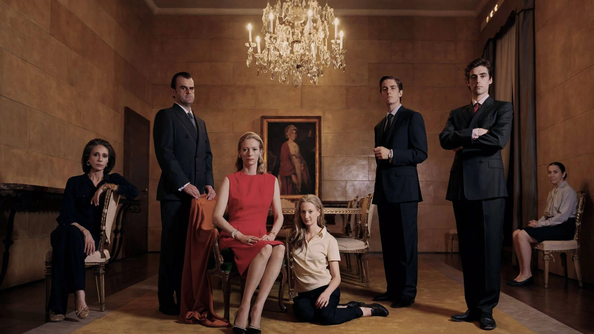
Marie antoinette
the power of texture: Sofia Coppola
as fans of texture, we love the way Coppola uses color but really uses texture to create emotional punch. in Marie Antoinette, these elements converge to convey the themes of excess and decay — while providing a visual feast. pure brilliance.


Tie me up! Tie me down!


The Last Emperor
palette poetry: Pedro Almodovar and Bernardo Bertolucci
think that Almodovar’s Tie Me Up! Tie Me Down! and Bertolucci’s The Last Emperor don’t have a lot in common? think again. these directors use color to create a visual shorthand of emotion of complex characters, whether you’re talking neurotic Spaniards or child emperors. dynamic, evocative, and beautiful.


The Shape of Water


Beetlejuice, Edward Scissorhands
telling stories with darkness: Guillermo del Toro and Tim Burton
we do love our moody hues. del Toro’s The Shape of Water was a masterclass in creating a sense of mystery and highlighting the themes of otherness. and Tim Burton: is there anyone better at rocking a dark look for maximum effect? Beetlejuice, the Addams Family, even Batman. why should riotous color have all the fun?


Moulin Rouge
the maximalist’s maximalist: Baz Luhrmann
it had to be Baz. rich, over-the-top, audacious, wild. no one uses color to create passion, excitement, melancholy, and romance quite like he does —vit’s unapologetically fantastic. new to Luhrmann? start with Moulin Rouge.
we still love black and white films (Cuaron’s Roma, Baumbach’s Frances Ha, David Fincher’s Mank, and George Clooney’s Good Night and Good Luck to name just a few) that use contrasting chromatics with intention to create their own mood, often — but not always — to take us back in time. it’s just that it’s a purposeful choice, not a default one.
but isn’t it nice to have more options with which to tell your own story?
that’s a wrap.
The Grand Budapest Hotel