erica tanov: sophisticated by nature
by clé tile | published: Dec 16, 2021

In an age in which designers of all types employ hype machines to “explode” onto the scene (many to burn out soon after), erica tanov is an anomaly.
quietly, steadily, she’s built a strong, loyal, and growing following of fans around the country drawn to her soft, organic, bohemian-luxe style that blends texture and nature with a love of vintage design. from clothing, she’s moved into interiors, and homegoods–all guided by her artist’s eye, meticulous sense of design, and her passion for creating seemingly effortlessly layered environments that combine sophistication with soul.
a testament to her artistry, generous spirit, and innate knack for bringing people together, her fans include fellow artists (with whom she often collaborates), writers, editors, designers, entrepreneurs, chefs…many of whom set the tone in their own fields.as artists and creatives based in the bay area, erica and clé founder deborah osburn had admired each other for years, drawn to each other’s work and their shared love of craftsmanship. osburn says, “i simply love her aesthetic, the way erica puts things together, and how so much of it is a celebration of nature–the ultimate artist.” in the end, the two came together to produce the erica tanov + clé collection, one of our most enduring artist collaborations.
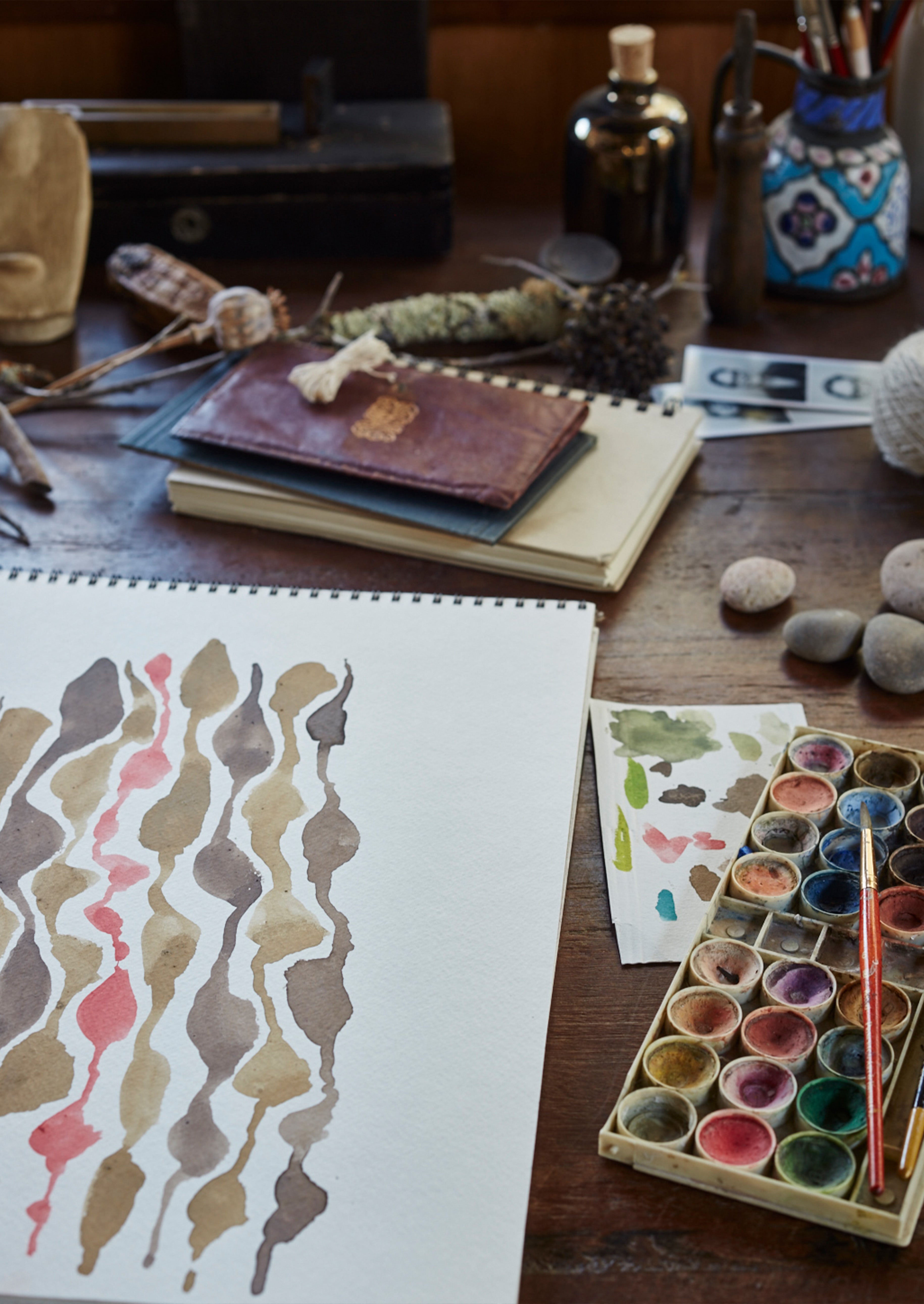
the collection includes tile that draws from inspirations and moods. there’s the perennially popular and recently expanded jacobsen inspired by a favorite tanov touchpoint: the endpapers of the antique books she collects. in 2021, plaster/black was joined by metal/leaf, metal/plaster, and plaster/taro.
baccio was taken from one of erica’s original prints inspired by vienna secessionist painter gustav klimt. boldly graphic 1965 is a nod to 60’s mod design. and award-winning shimmer consists of brass paillettes that together create a show-stopping installation that are both organic and luxurious.
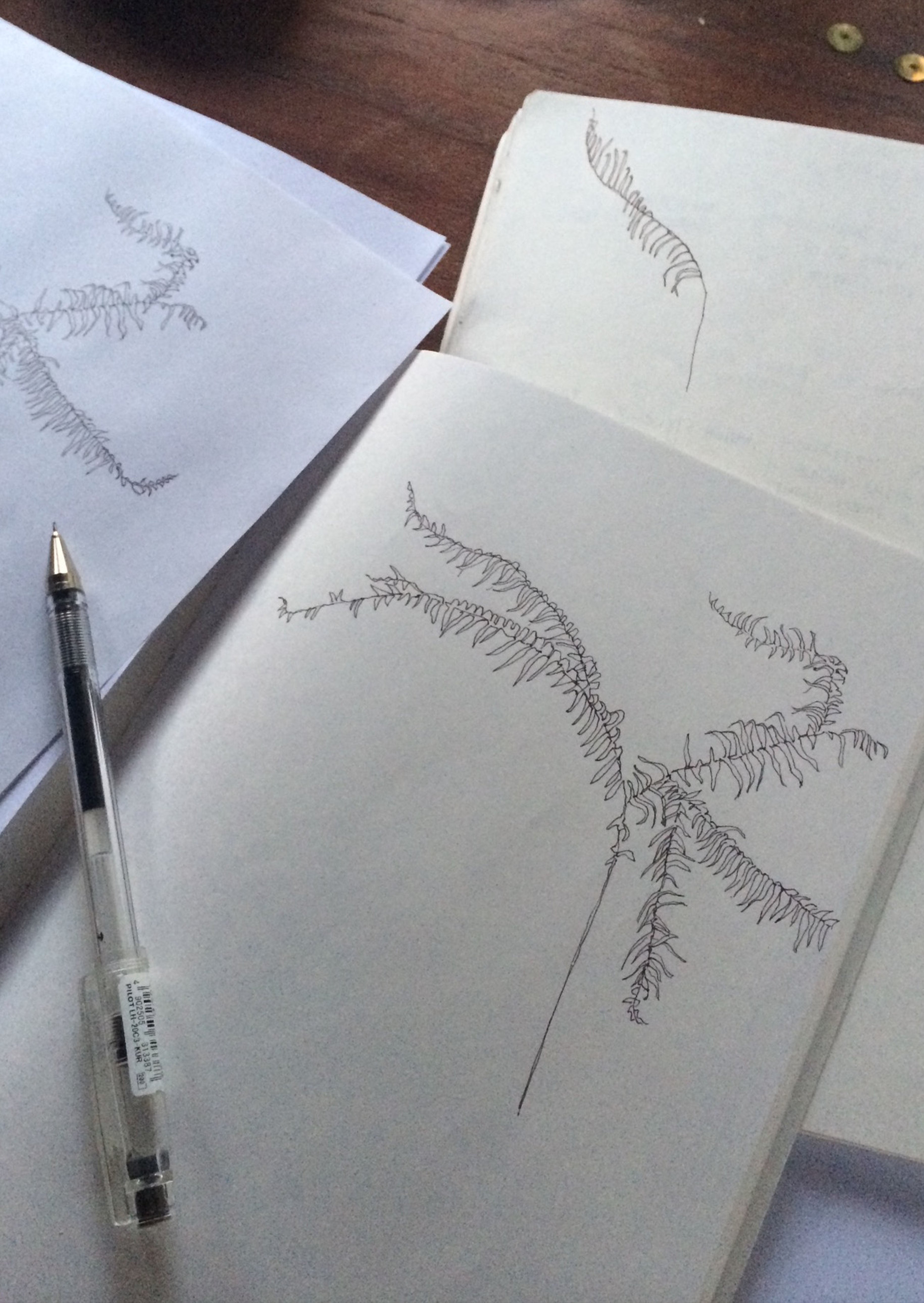
and most recently, we’ve further expanded the collection with fern, a signature motif directly inspired by tanov’s favorite muse: nature. it perfectly captures the perfectly imperfect–no wonder it’s found its way onto textiles for clothing and home, the cover of her book, design by nature, and now, tile.

osburn says, “in working with erica those years, i got to wondering: why haven’t we incorporated fern–erica’s signature–as part of the collection and thought that needed to change. i was also drawn to the challenge of capturing this delicate, gentle, hand-drawn sketch with a material like cement: could cement–so good at bringing to life bold, graphic design–capture the detail, nuance, and most importantly, the spirit of both the sketch and its subject? i think we got it just right.”one of the exciting parts of the collaboration is that it’s a two-way street: the designed-for-tile version of jacobsen inspired erica to create a new version of her print with which she’s created a new line of textiles-turned-homegoods. and so it continues…
we recently had a chance to connect with erica–always a delight– to talk designing for life, fern, and what’s next.
clé: artist. textile expert and designer. fashion designer. retail maven. author. and now, interiors, homegoods, and lifestyle designer. what’s the thread that links these all?
erica tanov [et]: the common thread that’s woven through all i do has to do with a sense of wellbeing: designing and creating objects and spaces with relaxed, natural beauty and a hint of opulence.
it stems from my belief in the importance of surrounding oneself with beauty in all forms: being a part of creating that beauty is what i love. to me, everything is related to our wellbeing: what we put in our homes and on our bodies (and of course in our bodies) affects who we are and how we feel about ourselves and each other. so i see all the elements of what i do–designing clothing, home goods and creating environments–all woven together with comfort and beauty always in mind and intertwined.

clé: how did the collaboration with clé come about?
et: deborah osburn and i have long been mutual admirers of what one another does. when i was approached by her to be part of clé’s artist series for the encaustic cement tiles, i jumped at the opportunity. it felt like a perfect marriage of aesthetics and mixing media. to see my designs for fabric translated into tile was incredibly exciting.a couple years following, deborah had the idea to reproduce the brass sequin wall i had designed together with envelope a + d for my marin store. the idea of making this shimmering installation–which i considered more of an art piece–available to others to have installed in homes, restaurants, hotels and beyond, was thrilling. clé had the brass oval discs made locally and launched the shimmer collection with 2 sizes of the brass “sequin tiles”. i’m always delighted when i see the creative ways in which people have installed the sequins.
next up is the fern cement tile for which i’m beyond excited! to see what has become a signature motif for my work formed on a cement tile in a variety of thoughtful color ways feels unreal!
clé: fashion and interiors, while they’re related, are different: fashion runs in seasonal and yearly cycles, while interior design–which still has its own trends–tends to have longer cycles. how do you find designing for both contexts?
et: i find the interior design cycle to make much sense and have adopted that for clothing as well. the short seasonal and yearly cycles of fashion don’t make sense to me and feel so wasteful: considering clothing “out of season” and therefore putting pieces on sale simply based on the calendar doesn’t feel right.
so i design my clothing and interior products together and usually launch them together when i’m inspired and when they’re ready. i believe in slow fashion and designing & making with intention, not churning out collection after collection based on a seasonal cycle that the fashion industry has fabricated.
clé: you’ve always been known for a certain eclecticism in your clothing and store environments, but in particular in your homegoods design. you weave together an organic sensibility with touches of boho, a love of classic lines and antiquity, and a few pops of 60s and 70s inspiration. how do you think that came about?
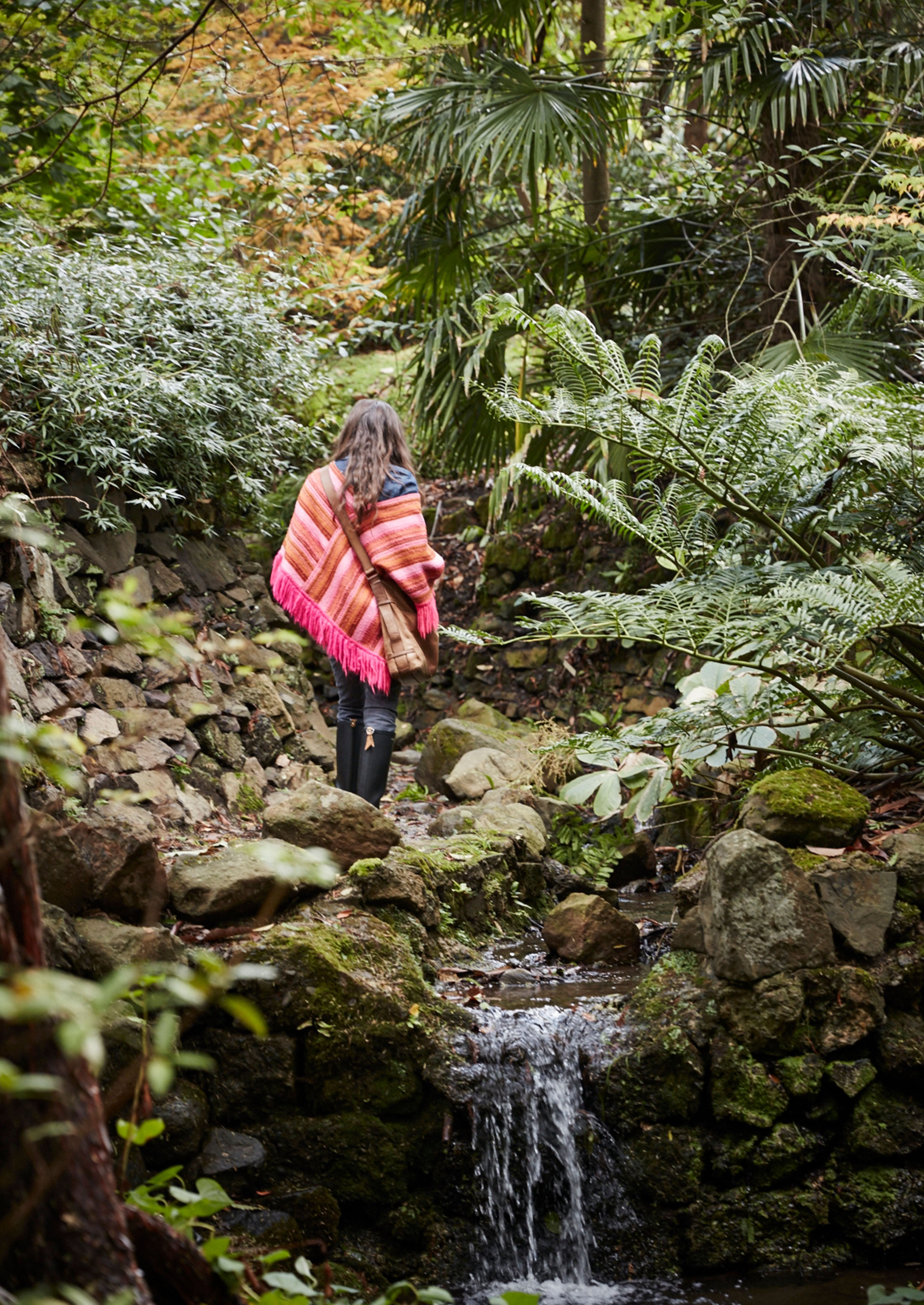
et: i’m sure i am a product of my environment. i grew up in northern california, surrounded by natural beauty. going on hikes with my dad throughout my childhood gave me a deep appreciation and awareness of the wonders of nature. i believe this early exposure to landscape led to nature becoming the foundation for my work–creatively and emotionally.i find endless inspiration in the textures, colors, patterns nature provides and solace and calm in its wisdom and grace. i was also an early flea market aficionado, learning to scour the markets with my aunt. the ‘love of the hunt’ took seed in me at a young age and has only grown as i get older.
discovering the history, quality and techniques of craftsmanship from centuries past intrigues me. i think growing up in the late 60s and 70s and witnessing some of the sublime styles of that time (flower children, soul train & american bandstand) yet not being quite old enough to wear and embrace the fashion, left a yearning in me for that era, so the 1960s and 70s often seep into my collections.

clé: what we love is that baccio, 1965, shimmer, and jacobsen are all very different. what was the inspiration behind each?
et: while nature is the reigning source of inspiration, i see beauty and find ideas all around me: artists, books, movies, city landscapes. the baccio print was inspired by gustav klimt’s painting, ‘the kiss‘ (hence the name ‘baccio’). klimt’s use of color, shape and texture formed such rich and opulent tapestries. ‘1965’ was based on the bold, graphic prints from the 1960’s. i named it after the year i was born. the ‘jacobsen’ pattern was part of a collection i designed inspired from the endpapers of antique books. i played around with size, color and scale to come up with a series of graphic prints, jacobsen being one of them. ’shimmer’ was inspired by the sparkling san francisco bay. the way the sun hits the water at a certain time of day is like scattering thousands of shiny coins along its surface. i wanted to achieve that effect by layering the brass sequins of ’shimmer’ on a wall.
clé: and now we’re launching fern together. fern is almost a signature pattern for you. tell us about fern, both its inspiration and how it came to be your signature.
et: my love for ferns started early, having grown up in the 70s and having them as houseplants. that love was then rekindled about 10 years ago when i began planting ferns in my front yard out of necessity since ferns are a plant that deer do not like to eat (and we have many deer who enjoy walking and nibbling through our front garden). what started as practical landscaping of a beautiful plant turned into an obsession. i’ve become fascinated with ferns: the endless species, their growth patterns, reproductive methods, colors, shapes and textures. i now have about 3 dozen species in my garden and continue to plant them as i find varieties i’ve never seen.
the fern pattern of the tiles, and that which has become a signature pattern within my work, came from a drawing i did of a fern’s shadow that appears on my front porch every morning. i’ve turned this drawing into a fabric design for clothing, bedding, home textiles, wallpaper, the cover of my book, ‘design by nature’ and now tile. it’s quite rewarding to see a pattern that’s so meaningful to me appear in so many forms.

clé: what was the process of turning textile into tile like? we have a notion that it’s a little more complex than applying a textile print onto a cement tile.
et: it was fascinating to work with a new medium, seeing how one of my prints that i designed for fabric could and would translate into tile. you have to think differently. how will it look repeated on a hard surface? what should the scale be: do we make it larger or smaller? how can we pare it down to work as a tile? do we use only a portion of a print for the tile design? what colors will work for tile and for how the tiles will be used? and then it comes full circle – the resulting tile may inspire a new print for fabric!
clé: you’ve installed jacobsen and fern in your own homes. how are you using it?
et: i used the jacobsen and fern tiles in the bathrooms of our cabin in the mountains. we have 2 adjacent bathrooms with similar footprints, so i thought it would be interesting to use 2 different patterned tiles but of the same colorway to make each bathroom have its own personality yet also be tied to one another.
i chose the metal/plaster combination and they’re absolutely gorgeous. the cement gives each tile a nuanced coloration and character, as if each one were hand painted. and i love the feel of the smooth, matte finish of the tile on my feet. i am also installing the fern tile into the hearth of our fireplace in my home in berkeley. it’s a subtle use of the tile which i thought made perfect sense: to have a patterned tile so close to my heart in a space where the whole family gathers.
clé: you clearly love (and excel at) creating environments—you’ve done it for yourself, for others, for your retail stores, and theater sets [anything else i’m forgetting]. what does your ideal environment feel like?
et: my ideal environment is relaxed, calm and comfortable, filled with meaningful objects – a mix of antique and modern. designer names are not so important as long as each piece is of high quality and has character. i’m drawn to pieces that are both functional and beautiful. a space should not feel too precious and untouchable. ‘lived-in grandeur’ is how a magazine once described my home. another publication coined me as an ‘imperfectionist’, which i love because it perfectly defines my style: how i embrace imperfections and revel in creating spaces that are thoughtfully undone.


clé: what’s next for you?
et: in 2022 we’ll be opening the doors of our new showroom and event space. it will be a space for arts & leisure: we’ll house the full erica tanov collection of interior goods–textiles, bedding, tabletop, wallpaper, furniture, tile and the evolving collection of vintage & antique finds. it will be open by appointment only. we’ll also curate exhibits of artists’ work and host events for musicians, writers, filmmakers, poets, chefs, sommeliers. i want it to become a beautiful creative hub of sorts.