in the green
by clé tile | published: Dec 10, 2021
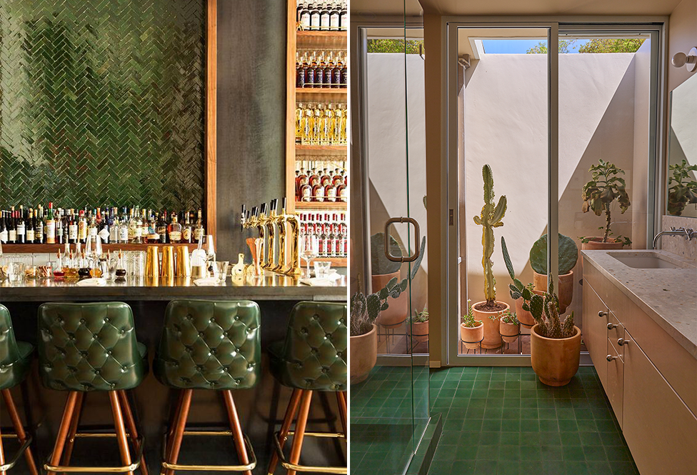
cindered olive bejmat zellige, design: ADG Architectecture + Design / photo: michael wiltbank + ivan halper (left) cement 4x4 square in leaf, design: Emily Farnham Architecture / photo: Yoshihiro Makino for Domino Magazine (right)
at clé, we have a deep affection for the color green. in fact, we think it is one of the more expressive of colors, stretching far beyond its association with all things natural.
we love its duality. afterall, how many colors can evoke renewal and sickness? or war and peace (camouflage and the olive branch)? patrician and ingenue? equanimity and jealousy (the ‘green-eyed monster’). if you’re curious about this shapeshifter of a color, take a dive into its history and associations.
here’s our take on some of our winning greens–yours for the picking.

earthy: when you need–literally–to ground your space
modern farmhouse brick deep green gloss
clé guild new california salvia
erica tanov fern in metal and leaf
erica tanov Jacobsen in metal and leaf
cinema collection: mythology duos and trios in dartmoor
cinema collection: mythology duos and trios in foxglove

tea ceremony bejmat zellige, design: Omgivning / photo: Bethany Nauert

cement 2x8 rectangle in basil, design: JR Corleto / photo: Virtually Here Studios
soft: when you yearn for a cool, zen feel with fresh appeal
Eastern Earthenware Dragon Bay
Basil Cement
Tea Ceremony Zellige
Watermark Kelly’s Cove: Wash
Watermark Jetty: Dip and Wash
Watermark - Gold Verdigris
Watermark Kelly’s Cove: Stroke
Watermark Jetty: Stroke
cinema collection: flanders duo in celadon + ru
cinema collection: flanders duo in grass + rouge

eastern elements in sacred river, design: roy hospitality group / photo: lauren edith andersen
spirited: for a hit of rich color
kelly cement
fallen citrus zellige
forgotten turquoise zellige
eastern earthenware koi pond
fornace brioni | glazed ceramic tivoli (bundle) with forest green
fired opal zellige
cinema collection: mythology duos and trios in flanders
cinema collection: mythology foxglove duo in lapis + olive
cinema collection: mythology salon duo in olive + flame
cinema collection: mythology oz duo in nettle + abyss

(above) malachite
sophisticated: to strike a grown up, considered, characterful tone
leaf cement
cindered olive zellige
secret lagoon zellige
watermark kelly’s cove: stain, dip
watermark jetty: stain
malachite
fornace brioni + cristina celestino mint rocaille
cinema collection: mythology dartmoor duo in forest + army
cinema collection: mythology foxglove duo in mallard and forest
cinema collection: mythology foxglove trio in mallard, forest + charcoal
cinema collection: mythology flanders trio in forest, chestnut + ale
lapidary collection


cement big spin, design: barker associates architecture / photo: lesley unruh
dynamic: when a graphic tile is what’s called for
hex clip: kelly and white
new west: kelly and white
point: kelly and leaf
radar hex: kelly
try angle line: kelly
big spin: kelly, leaf, and federal blue
zenith: kelly and white
moroccan one andalucia: white, kelly, and nautical blue
erica tanov jacobsen: metal and leaf
cubicon slant: powder, federal blue, teal square
diamond twist: federal blue, powder teal, plaster
