the power of grout
by clé tile | published: Mar 19, 2024
ah, grout. an integral (yet often overlooked) part of any tile installation. what to consider — and what to avoid — when looking for *the one*.
if you think grout is just an add-on product for your tile, think again. while we like to point out that the success of your tile installation mostly depends on hiring the right tile installer, the color of grout you choose to pair with your tile selection can make (or break) a project. it’s a crucial element that can have a huge impact on your space for the life of your tile.
how to pick a grout color
We often get asked to recommend a grout color for a specific tile, but it’s not so simple. grout can look completely different from room to room because of factors like natural light or placement within the space. below, we cover all the different x-factors you must consider when choosing your grout.
test with sample tiles
one approach we strongly recommend… something we actually consider mandatory: pick the grout colors that you most like, then ask your contractor to mock up some sample boards with excess tile from your order in what we call grout trials. grout trials enable you to have a more true-to-life way of seeing what works best in your space, and are the only way to test for all of these x-factors. yes, grout trials add time and labor to the process, but if your contractor doesn’t see the importance of making these boards, we suggest finding a new contractor. that’s how crucial this is.

consider your tile color and size
whether you go with a warm grey, a cool beige, or a bright white all depend on what the color of your tile is — and we’re not just talking about the glaze, but the material as well. if your tile is a zellige, you likely want something minimal and subtle; if it’s a graphic cement pattern, perhaps you want your grout to highlight one of the pattern’s colors; if you’ve selected a delft tile, then you probably want no contrast at all.
the size and shape of your tile will also be a factor. generally, the smaller the tile, the smaller the grout joint (the space between each tile that’s filled with grout); the larger the tile, the thicker the grout joint. so, depending on what kind of effect you’re after, and how much of the grout you’ll actually be seeing, you can determine which color works best for your installation.

zellige tile in shattered pearl. design: casa dos oaks interior design / photo: salt design haus
consider room size and lighting
any surface will change in shade, and even color, depending on the time of day. because of this, clé recommends that you select several grout colors that best match your tiles and see how they look — with your tiles — as the light changes throughout the day. this is particularly important for rooms with lots of natural light, but even if it’s a space illuminated by indoor lighting, we recommend using different bulbs and wattages (even candles) to get a good sense of how the grout will look.
create visual effects
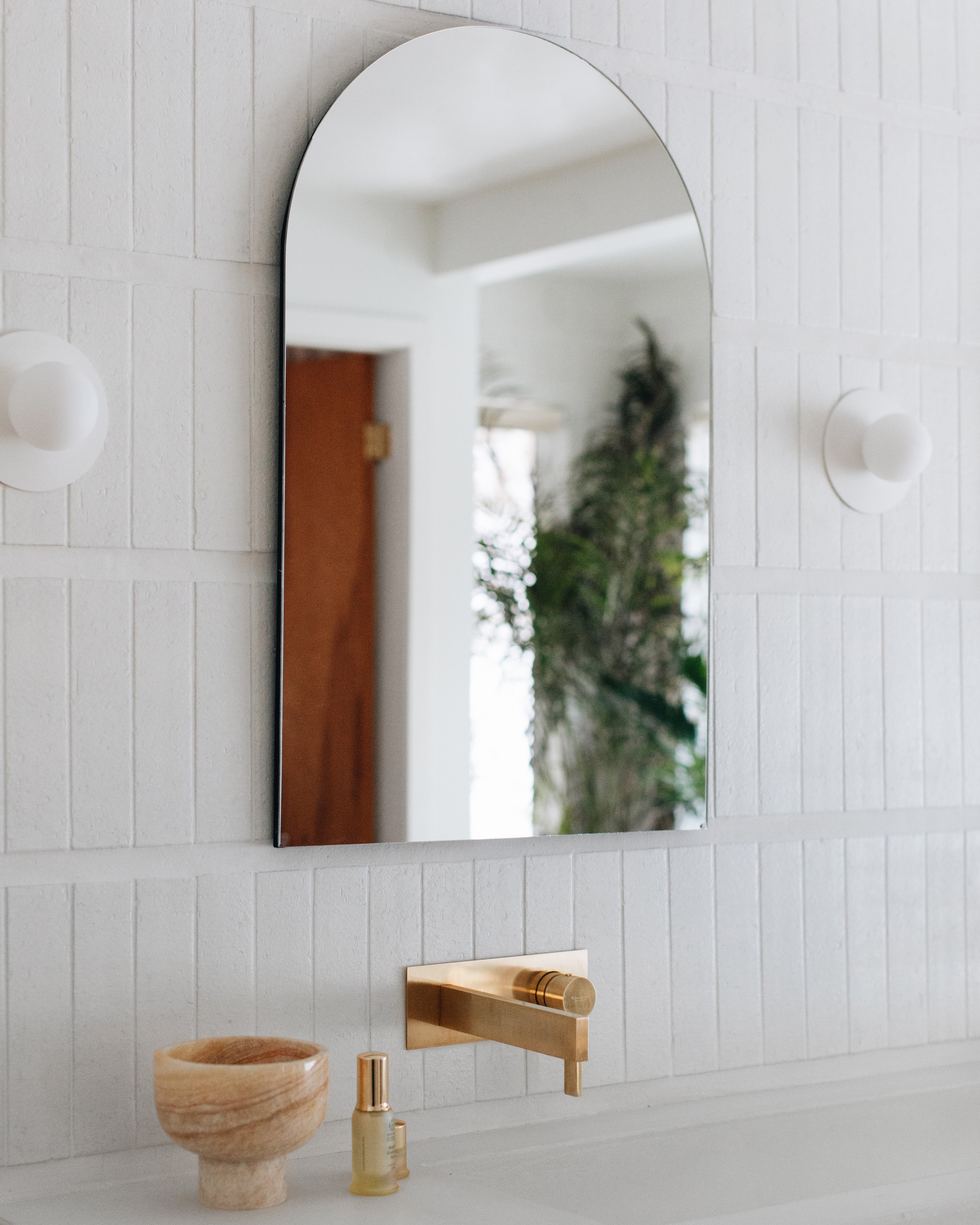
beyond playing a very basic, functional role in your installation, grout can act as an interesting design element that has a big impact on the overall look. the color you select, combined with how you choose to use it, can often create striking visual effects that give your space flair (or, in equal measure, quiet sophistication). much of this has to do with the size of your grout joint which, if done with intention, can highlight your tiles’ materials, create patterns, or even imbue your space with a sense of time and place. fancy the french country, mid-century, or italian villa looks? your grout can work with your tile to achieve the vibe you want.
balance style and practicality
when it comes to knowing the specs of different grout colors and types, your contractor should be the expert. they should be experienced enough to know which grouts will perform the best for your projects, and they will have grout manufacturers that they favor. your contractor is ultimately responsible for your grout choice.
that said, it’s not all just about performance — you and your design team (be it your architect or interior designer) should ensure your installation highlights the beauty and character of your tile as you imagined it. working together with your contractor, you should find a happy solution as a group to select a grout that meets all of your needs, aesthetically and otherwise.
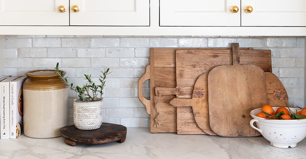
Modern farmhouse brick with white grout. Design: sarah sherman samuel / photo: stoffer photography interiors
modern farmhouse brick with neutral grout. Design: alexandra silverman studio / photo: erin scott studio
understand the undertones
grout undertones, which are subtle shades that emerge when grout interacts with surrounding colors, can either enhance or detract from the visual appeal of a space (another solid argument for doing comprehensive grout trials!). mismatched undertones might clash with your tile, whereas a grout with complementary undertones (or ones that offer subtle contrast) can elevate your installation and make it more cohesive. a keen awareness of undertones goes far to ensure a satisfactory outcome.
explore neutral colors
because of the complexity involved in selecting the right grout that suits your specific tile in your specific space with your specific lighting, neutral grout colors are a popular choice — and it’s our general recommendation as well. finding a grout color that matches, complements, and enhances your installation is much easier to do when looking at neutrals than at the rest of the color spectrum. keep it simple and limit yourself to exploring the range from white grouts to greys and beiges — it’ll still be a journey, but a more manageable one.
coordinate with overall color scheme
if you stick with a neutral palette for grout, odds are that you’ll find something that works for your overall color scheme. in our expert opinion, grout should be a supporting player, never upstaging the tile. otherwise, you risk an overly busy installation that could make it hard to furnish and decorate. take it from us: grout is the one place we encourage people to play it safe.
so here’s the long and the short of it: your installer is your best resource for ordering grout. to learn more, check out our grout guide, here.
popular grout color options and their effects
to showcase the impact of grout color, we have taken the ubiquitous white subway tile (in 3×6) and paired it with eight different grout colors to show how dramatically a tile can change depending on the grout selection.
an important note: flat subway tile can look great with high contrast grout. however, contrasting grout colors used with any tile can result in issues including showing invisible crazing and noticeable texture that can create undesirable changes in the color of your tile. always test, and test again, and use at your own risk.
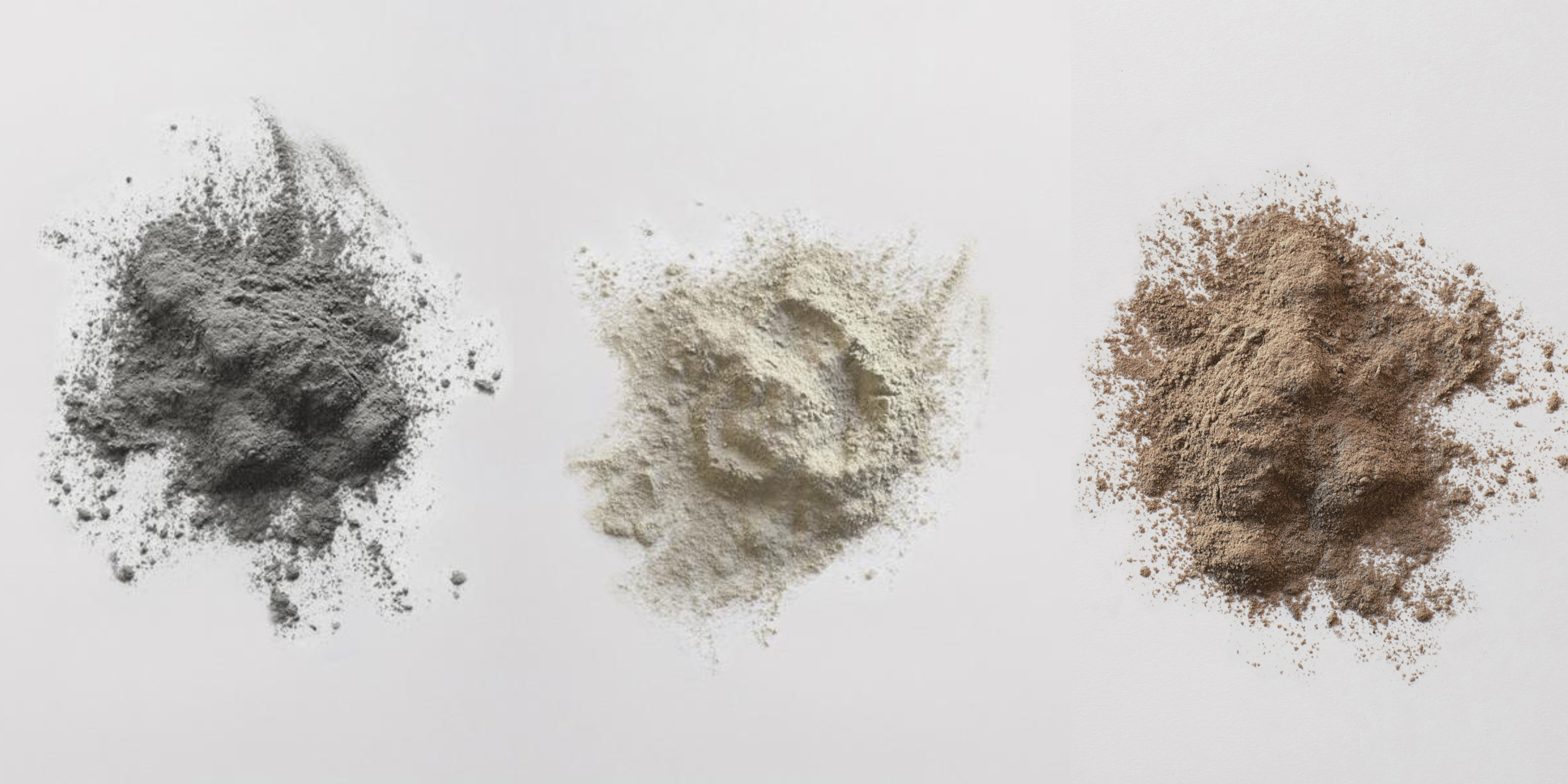
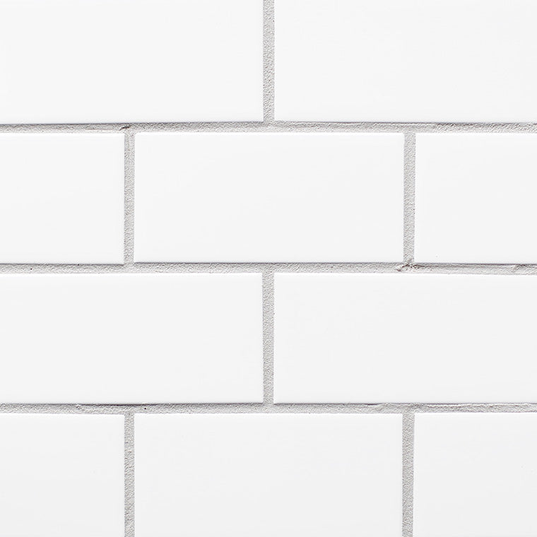
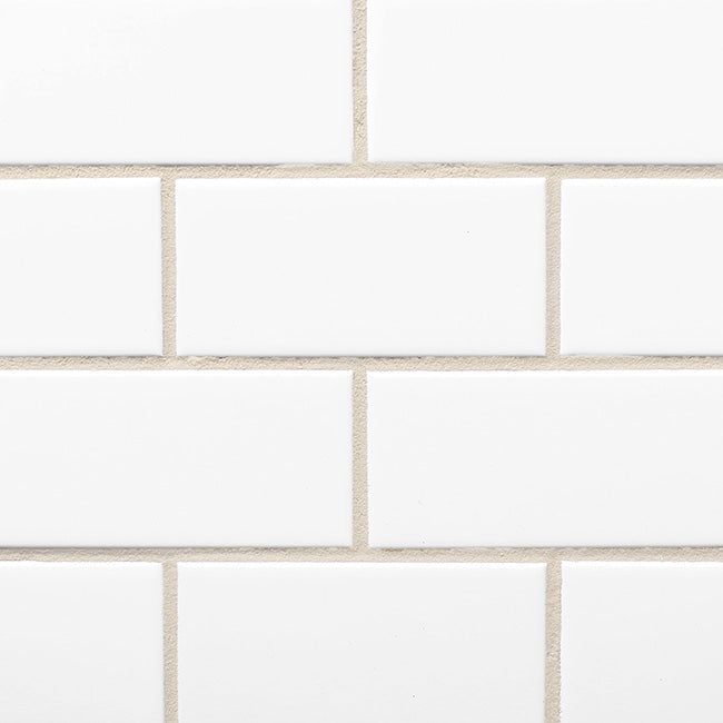
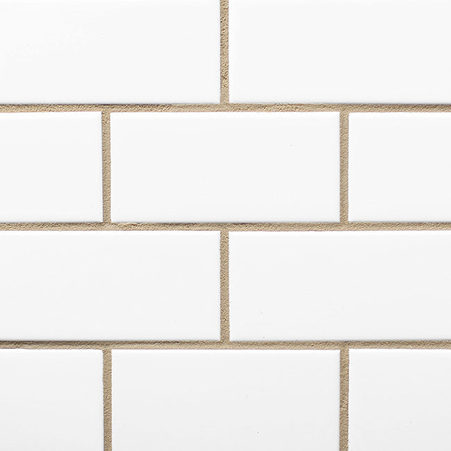
white grout (+ other very light-colored grout)
for a seamless, clean and uniform look, pair white grout with a white or light subway tile. the grout will seemingly disappear, allowing the tile to take center stage.
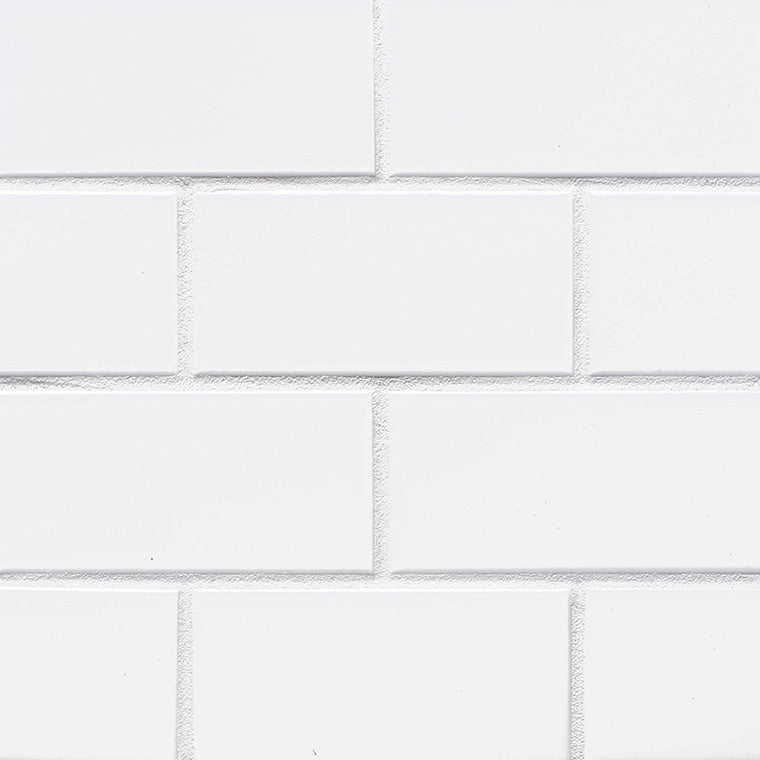
to start, here is a very white grout. pairs well with white subway, white solid cement or white penny rounds.
a very light grey grout is our go-to for weathered white zellige. also pairs well with carrara planks.
a word about white and light grouts: despite your best sealing and maintenance of it, it may still stain or darken in heavy traffic areas, so proceed with caution.
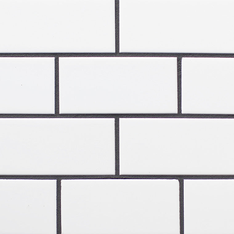
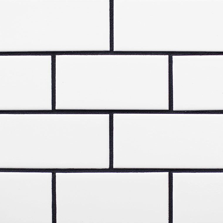
dark-colored grout
dark-colored grouts can be used to contrast a lighter tile — making a bold statement and highlighting the layout of your installation. on the flip side, if you’re using a dark-colored tile, these grout colors can be used to create an uninterrupted, cohesive look.
however we actually suggest that you avoid highly contrasting grout colors.
high-contrast grout used with any tile, including subway, can result in issues including showing invisible crazing and noticeable texture that can create undesirable changes in the color of your tile. If you’re inspired to take this road, we recommend you test on multiple pieces of tile and wait to see whether it produces any undesirable effects.
deep, dark grey-colored grout looks great with darker colored tile for a seamless look. it’s a perfect complement to a grey or dark green tile. think belgian reproduction or cindered olive.
black grout offers a dramatic look, but must be used with extreme care, and only on tiles that are not porous. never use it on any tile with crazing or noticeable texture where high-contrast grout will create undesirable changes in color on your tile.

zellige in scribes ink. Design: sally breer / photo: aaron haxton
that being said, high contrast grouts may be an option with subway (and even then we’re not fans), but we'll say it again: use it with extreme care! high-contrast grout used with any tile, including subway, can result in issues including showing invisible crazing and noticeable texture that can create undesirable changes in the color of your tile. If you’re inspired to take this road, we recommend you test on multiple pieces of tile and wait to see whether it produces any undesirable effects.
neutral grout
options for neutral grout include earthy browns and greys that pair with many tiles. these are the middle ground for grouts and can really pull dark or light, depending on what they’re paired with.
a creamy neutral pairs well with our natural unglazed zellige. it also pairs well with our weathered white, pulling it away from the cooler tones and adding some warmth.
a medium earthy brown looks great with foundry flats brick tiles.

pair a caramel-toned grout with any of our red terracotta tiles. a deep caramel color pulls brown in tone and pairs well with some of our foundry flats bricks as well.

a medium grey grout is a good fit for many tiles. we recommend this color with any of our cement tiles.
tile and grout color combinations to consider
we already mentioned that grout as a design element can work with your tile to create a vibe that tile alone couldn’t achieve. from rustic to contemporary, bold to neutral, here are some past pairings ranging from wonderfully expected to utterly surprising.
classic + timeless
if you appreciate a well-worn pair of jeans, you’ll probably prefer a classic grout color, like white or light grey grout with white tile. (again, keep in mind that light-colored grouts tend to darken in high-traffic areas.)
contemporary + neutral
itching for something neutral but also easy to maintain? you might favor an earthy brown or grey grout, which can pair with just about anything.
rustic + warm
for something more rustic, you might pair a neutral beige grout with a tile like weathered white zellige. this pulls things away from the cool side of the spectrum and creates a decidedly warmer look.
bold + dramatic
if you’re feeling dramatic, a high-contrast grout can make a bold statement and really highlight your tile pattern. think: white grout next to glossy black farmhouse brick, or dark grout next to white subway tile. (just be sure to read our caveats about high-contrast grout above.)
coastal + serene
want something coastal and serene? opt for a grout color that complements your space’s overall color scheme. in general, matching your grout closely to your tile lends a greater sense of calm.
monochromatic elegance
for a monochromatic look, consider matching your grout color to your tile color, such as charcoal grout with foundry flats or caramel grout with red terracotta tiles. the result is not only elegant but can also make the room appear larger.
the impact of grout color on the final look
now that we’ve armed you with tons of info and inspo, we hope that the role grout plays is clear in a few key ways:
visual impact
grout joints, whether thick or thin, can serve as architectural elements; grout color, whether matching or high-contrast, can influence the way your tile looks. a thoughtful grout choice will work in concert with your tile color, tile shape, ambient lighting, and design aspirations to create a space that you will treasure (and that will endure) for years to come.
perception of space
depending how you use it, grout can play a big role in shaping the perception of a space. find a matching grout to blend seamlessly with your tiles and you can create a sense of expansiveness and airiness, or go with a darker grout to add depth and drama, making for a more cozy ambience. there’s no wrong answer.
creating a focal point
by giving you the ability to accentuation patterns in your tile, act as a border to frame specific areas, and generally add texture and dimension to any installation, grout can be used cleverly to create different focal points in your space. with a little creativity, grout can be transformative. (but don’t get too creative, per #3 on our no-goes.)
so that’s grout in a nutshell. there’s nothing to be afraid of. as with all things clé, there’s no shortcut, but there are words of wisdom: be thoughtful, be smart, and be bold.